← Back to All Work
 Illustrator
 InDesign
 Photoshop
Brand Identity
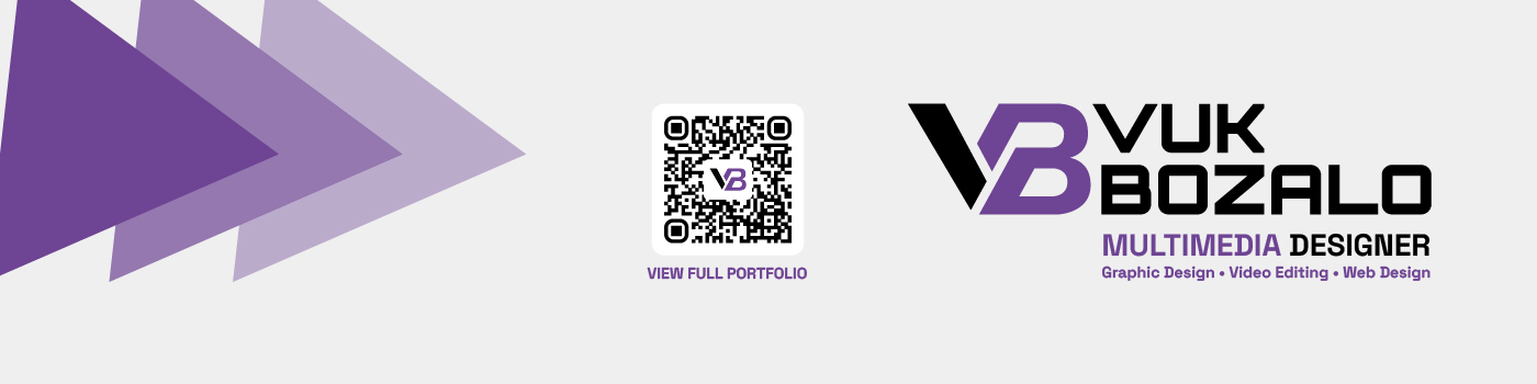
VB Personal Brand Identity
A cohesive personal brand system created to connect my logo, portfolio, print materials, website, and professional presence as a multimedia designer.
Brand Identity / Web Design / Print Design
Illustrator
InDesign
Photoshop
HTML
CSS
JavaScript
Overview
Building a visual identity for myself as a multimedia designer.
This personal branding project represents the process of creating a visual identity for myself as a multimedia designer. The goal was to build a brand that felt professional, flexible, and personal while clearly connecting to the type of work I do: graphic design, web design, video, and print.
I wanted the identity to feel clean and structured, but still have enough personality to stand out across my portfolio, resume, website, and future professional materials. The final system connects my logo, colour palette, typography, print portfolio, website, and professional applications into one consistent brand experience.
Logo Development
Refining the VB monogram through multiple iterations.
The logo was one of the most challenging parts of the project. I went through multiple iterations because I found it difficult to combine the letters V and B in a way that felt balanced, readable, and unique. At first, I focused on making the mark work in simple black and white. This was important because I wanted the logo to be strong enough without depending on colour.
Once the structure of the monogram felt more resolved, I started exploring how colour could add more personality and meaning to the brand. The final version uses strong geometric forms, a deep ink tone, and a purple accent to create a mark that feels modern, compact, and recognizable.
Colour Direction
A purple-based palette connected to multimedia, motion, and digital work.
After developing the logo in black and white, I asked myself what colours best represented the type of work I create. I wanted a palette that felt modern, creative, and connected to multimedia. Purple became the main brand colour because it evokes creativity, digital media, motion, and video, which are important parts of my design practice.
Since video and multimedia are a major part of my specialty, the purple direction felt like a natural fit. The main logo uses a muted purple for the letter B, while the print and video applications use a slightly deeper purple variation. I paired these tones with deep ink and clean white space to keep the identity professional and polished across both print and digital formats.
Typography
Combining expressive headings with clean readable body text.
For typography, I wanted a combination that felt modern, clear, and versatile across both print and digital formats. I chose Space Grotesk for headings because it has a bold, contemporary look that gives the brand a strong visual presence. For body text, I chose Inter because it is clean, readable, and works well for longer content, navigation, and interface elements.
Together, the two typefaces help the brand feel structured, professional, and easy to use across different applications.
Used for headings, titles, and brand moments.
Used for body text, paragraphs, navigation, and interface content.
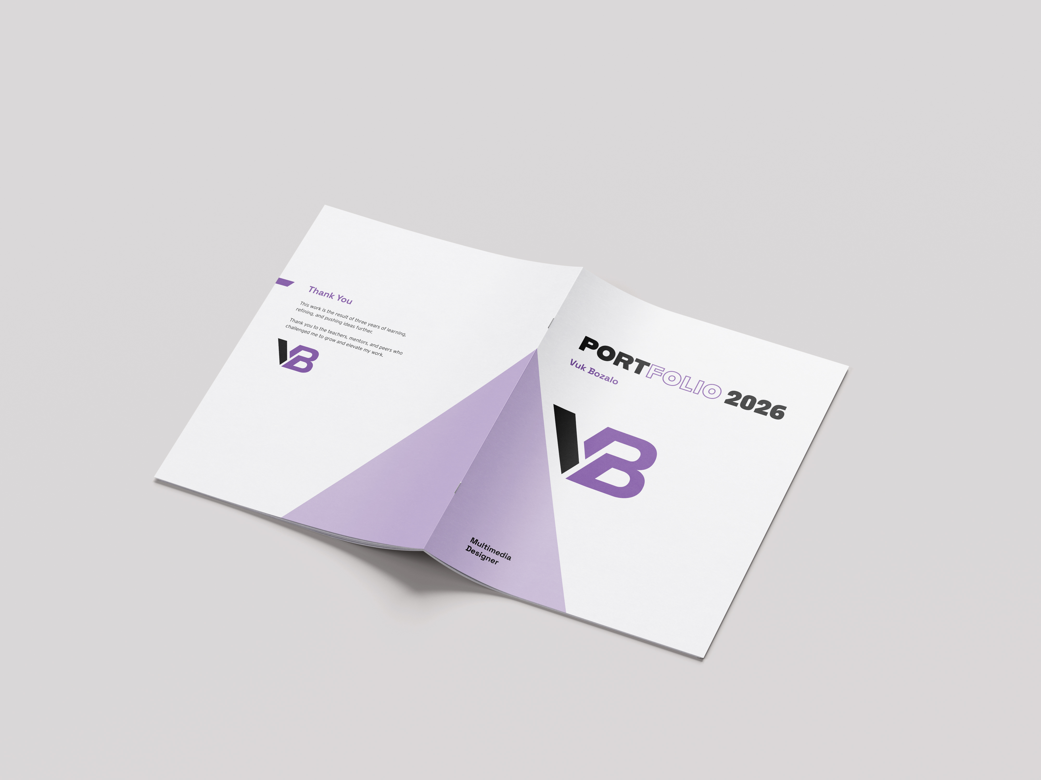
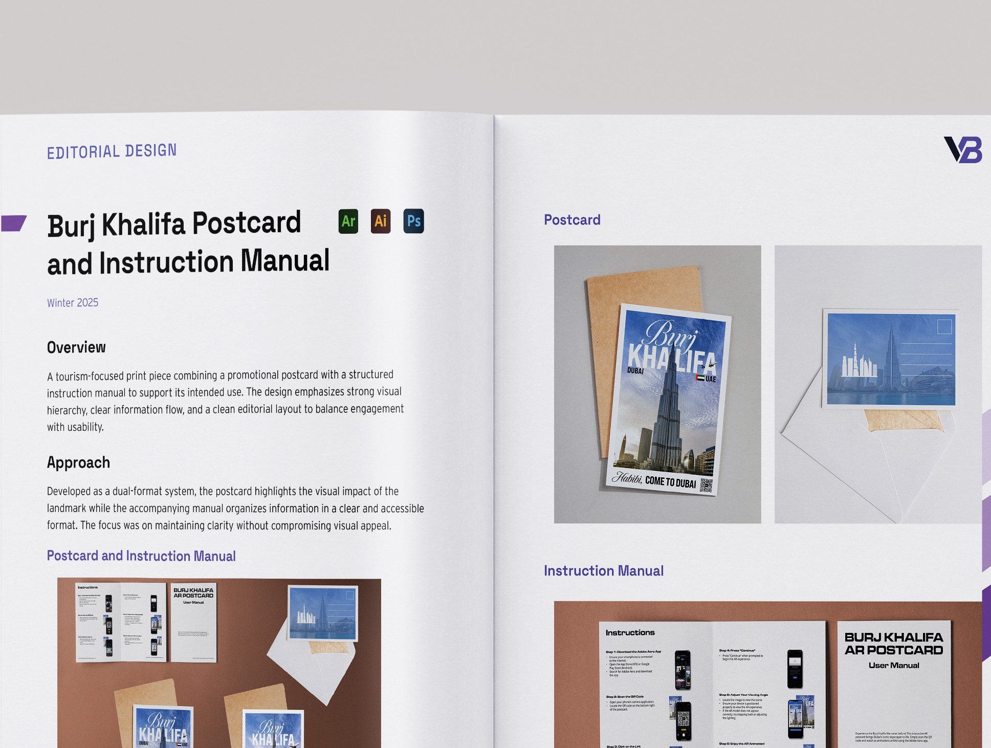
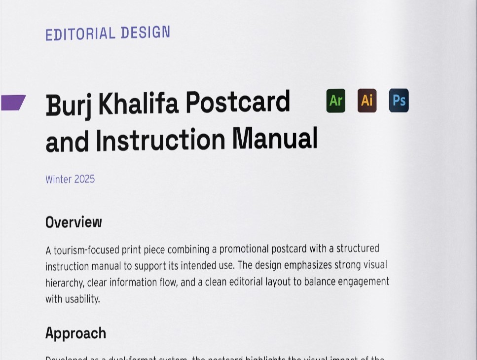
Print Portfolio
Translating the brand into an editorial print portfolio.
I applied the brand system to my print portfolio by using the VB monogram, purple colour palette, typography, and consistent layout structure throughout the booklet. The print portfolio gave me the opportunity to translate my identity into a more editorial format.
I focused on clean spacing, strong hierarchy, large project visuals, and a polished cover design that uses the logo as the main visual element. This helped the printed piece feel connected to my overall identity rather than feeling like a separate portfolio document.
Website Portfolio
Extending the identity into a responsive digital experience.
The same visual system was then applied to my website portfolio. I used the colour palette, typography, logo, spacing, and layout style to create a consistent digital experience. The website became an extension of the print portfolio, allowing my work to be presented in an interactive and responsive format.
I designed and coded the site to showcase my work in a clear, responsive, and professional way. The goal was to make the experience feel polished, easy to navigate, and aligned with my personal brand while also showing that I can build a complete portfolio website from the ground up.
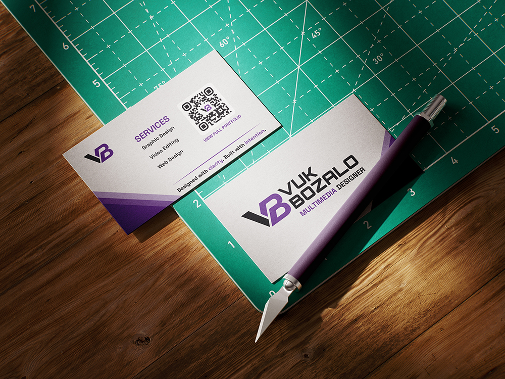
Brand Applications
A flexible system for professional outreach and self-promotion.
The final identity was designed to work across multiple professional applications, including my logo, website, print portfolio, business card, LinkedIn banner, and other self-promotional materials. This was important because I wanted the brand to function as a complete system, not just a single logo.
By applying the same visual language across different formats, I was able to create a more cohesive and recognizable personal identity.
Reflection
Designing for myself with the same care as a client project.
This project helped me understand the importance of designing for myself with the same level of strategy and care that I would use for a client. Creating my own brand required many decisions about how I wanted to be perceived as a designer, what kind of work I wanted to highlight, and how to make everything feel consistent across print and digital platforms.
The final result reflects my identity as a multimedia designer and brings together my interests in branding, typography, web design, print, and video into one cohesive system.