← Back to All Work
 InDesign
 Illustrator
 Photoshop
Editorial Design
Ostrog Monastery Brochure
A four-panel folded brochure designed to communicate the history, spiritual significance, and visitor information of Ostrog Monastery through a respectful editorial layout, strong hierarchy, and a warm visual tone.
Editorial & Print Design
InDesign
Illustrator
Photoshop
Overview
A compact editorial piece built to inform with clarity and respect.
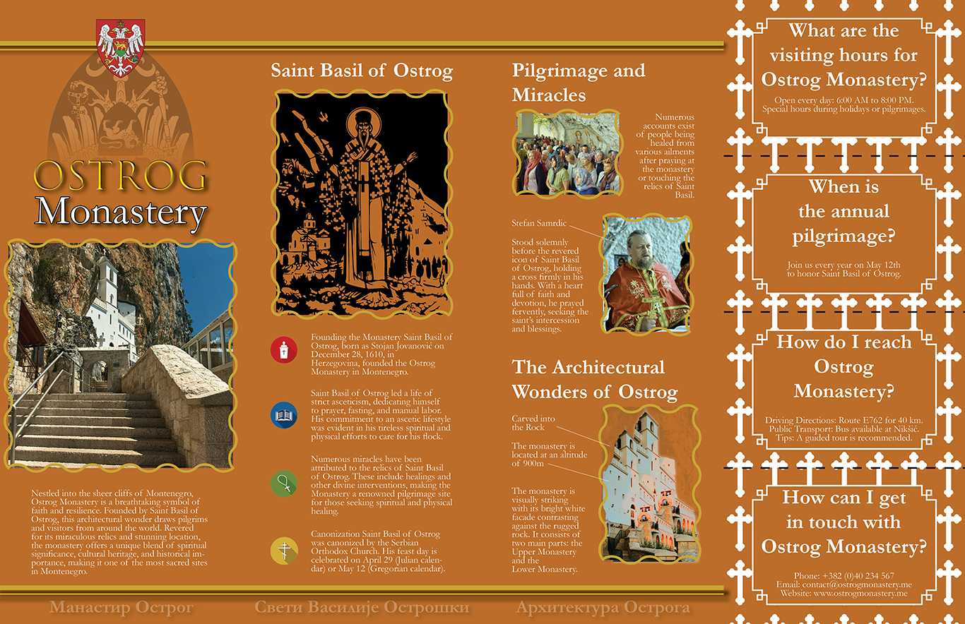
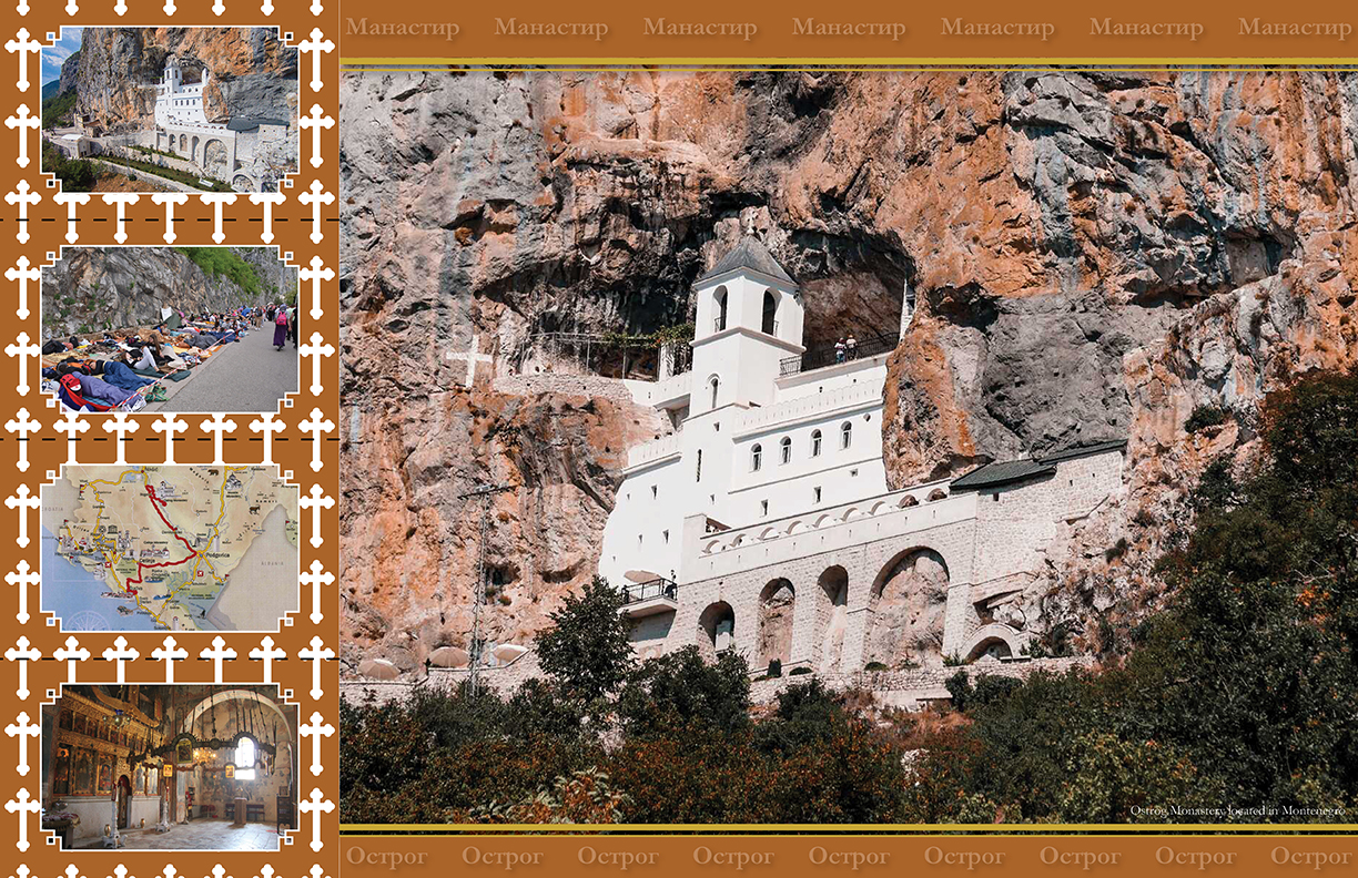
This brochure was created as a four-panel folded print piece that introduces readers to Ostrog Monastery through a clear and approachable editorial structure. The goal was to communicate historical context, cultural significance, and practical visitor information in a format that felt organized, readable, and visually thoughtful.
Because the subject matter carries strong spiritual and cultural meaning, the design needed to feel respectful while still functioning as an engaging publication. The final result is a brochure that balances atmosphere, readability, and editorial control within a compact format.
Approach
Warm tones, strong imagery, and structured information design.
Research into the monastery's background informed the overall direction of the brochure. The layout was built around clear sections so readers could move through the content logically, while typography and spacing were used to create hierarchy and improve legibility.
Warm tones and carefully selected imagery helped reinforce the tone of the piece, supporting the subject matter without overwhelming the content. Rather than treating the brochure as a simple information sheet, I approached it as a cohesive editorial publication with rhythm, balance, and visual consistency across every panel.
Details
Balancing cultural sensitivity with print functionality.
One of the main challenges in this project was presenting a substantial amount of information within a limited physical format. To solve this, the content was broken into organized panels that could guide the viewer naturally through the brochure without feeling crowded.
A detachable bookmark was also integrated into the design, adding a meaningful functional element to the print piece. This extra component helped the brochure feel more considered as an object, not just a flat layout.
Overall, the project demonstrates editorial thinking, print precision, and attention to detail, while showing my ability to work with culturally significant subject matter in a clear and respectful way.
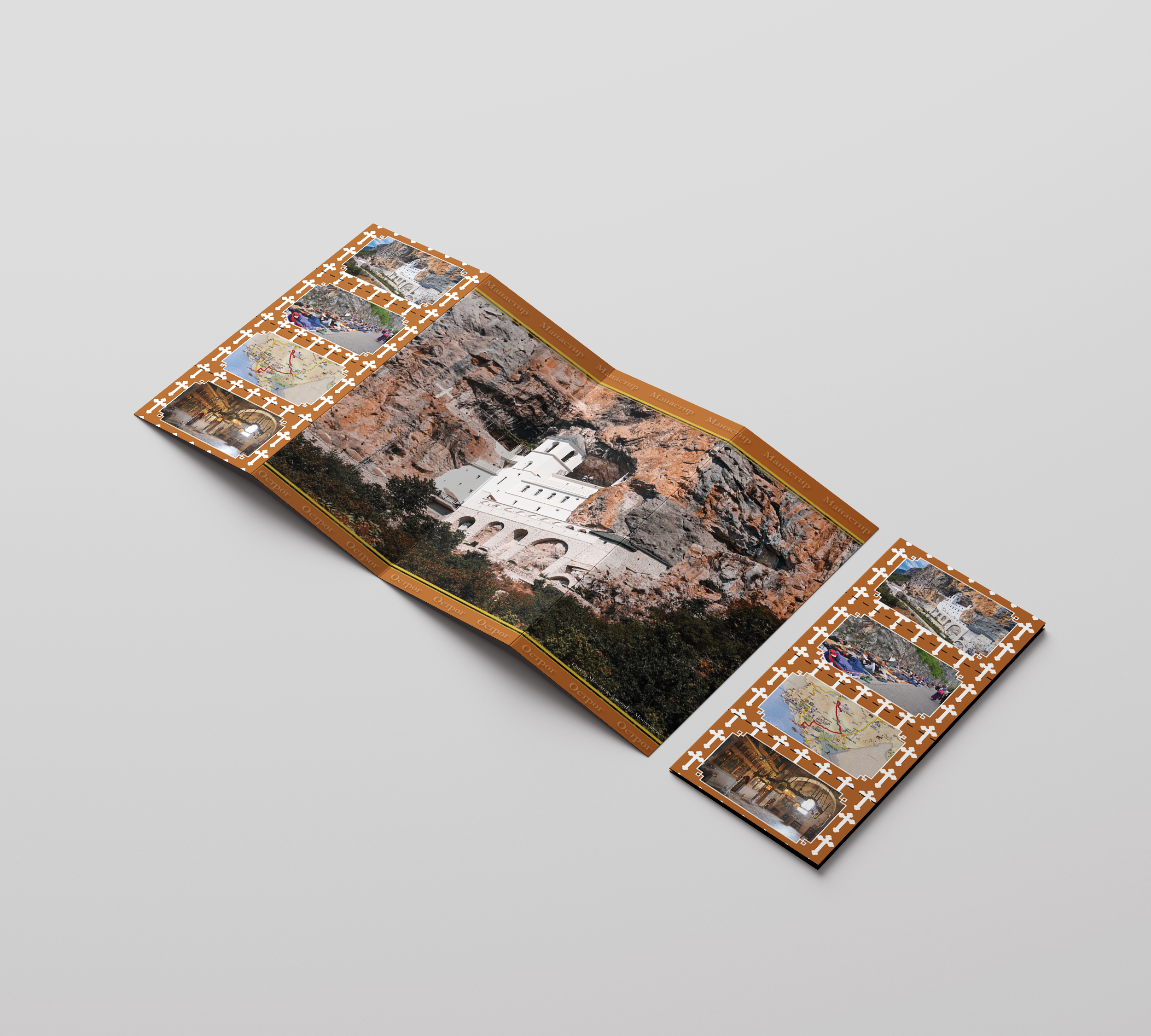
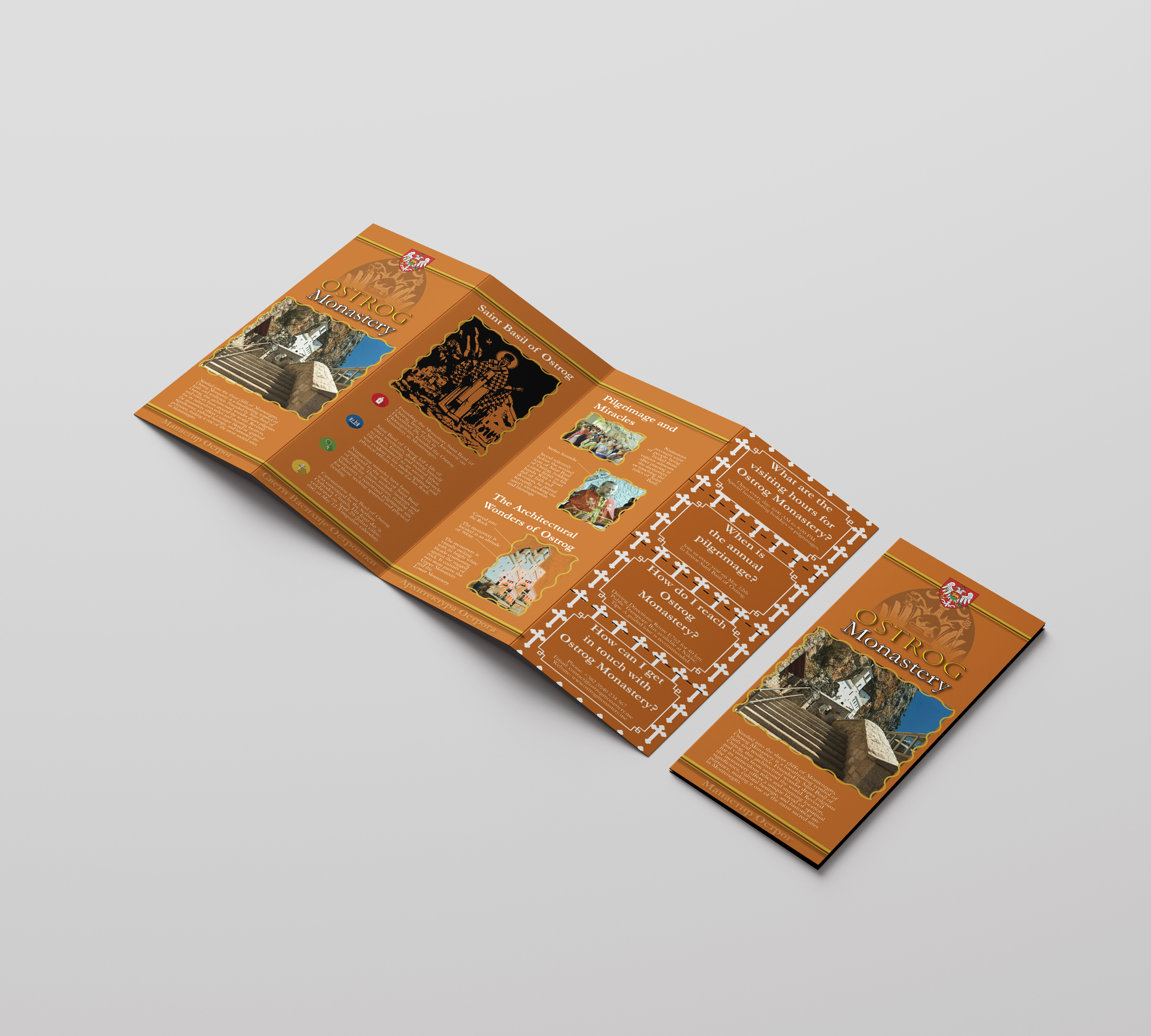
Selected Mockups
Brochure spreads, folded views, and presentation mockups from the final piece.