← Back to All Work
 Photoshop
 Illustrator
Branding
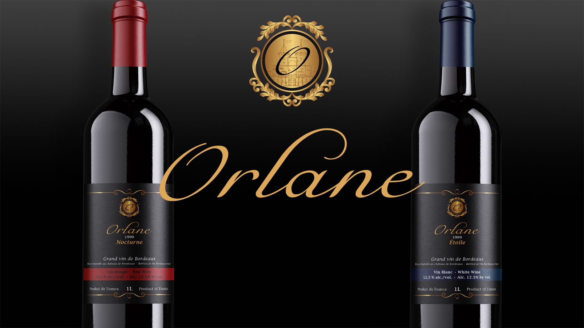
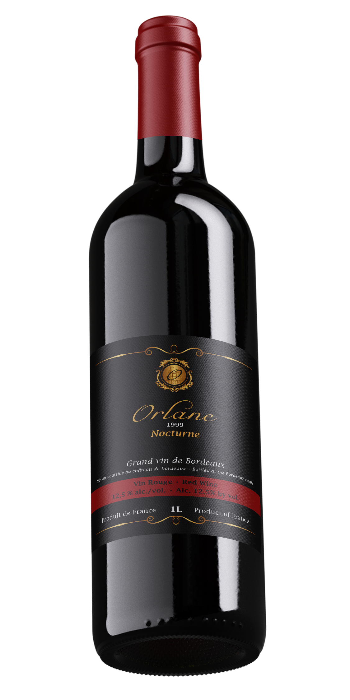
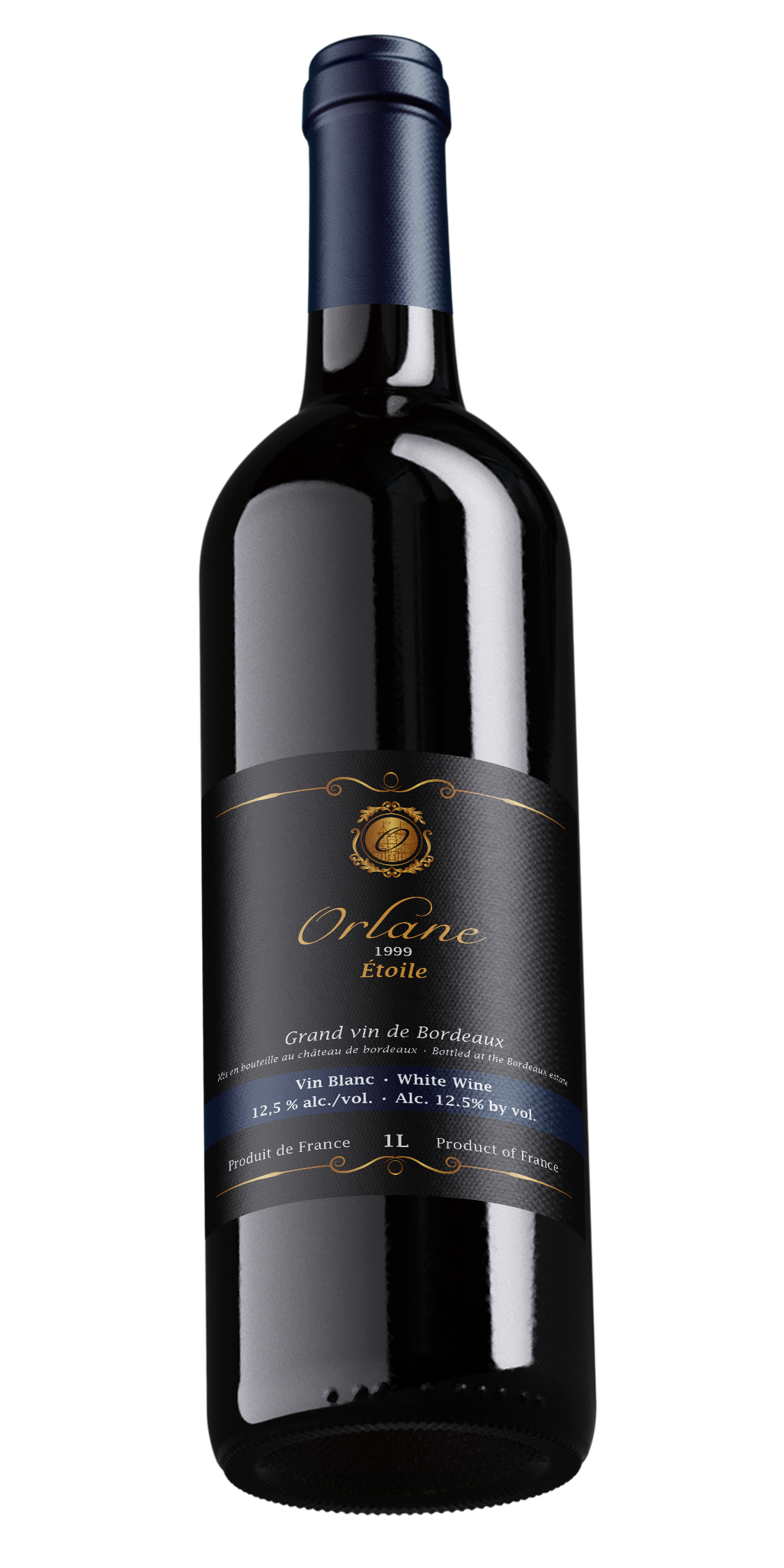
Orlane Wine Branding
A complete wine brand identity built across label design, bilingual packaging, and merchandising display, created to balance a premium visual presence with readability, regulatory information, and retail presentation.
Branding
Photoshop
Illustrator
Overview
Project Description
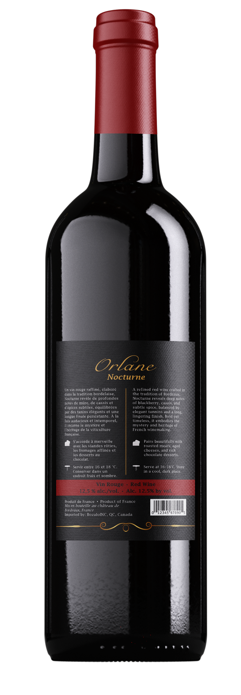
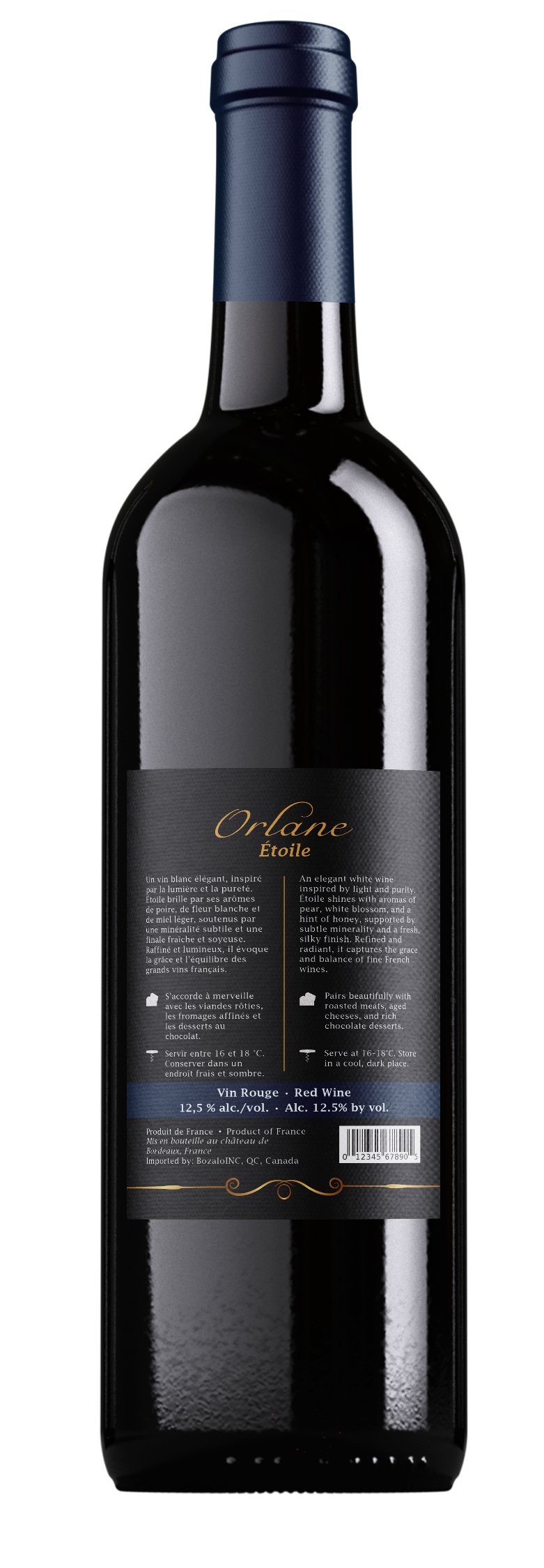
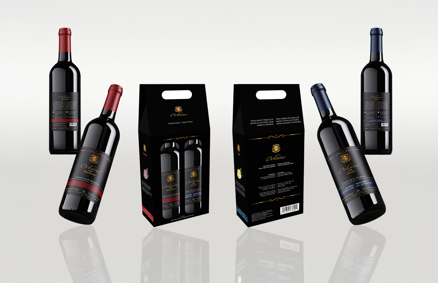
Orlane was developed as a complete wine brand identity designed for retail presentation across multiple touchpoints. The project included logo development, a refined label system, typography selection, and a premium color palette applied consistently across the brand.
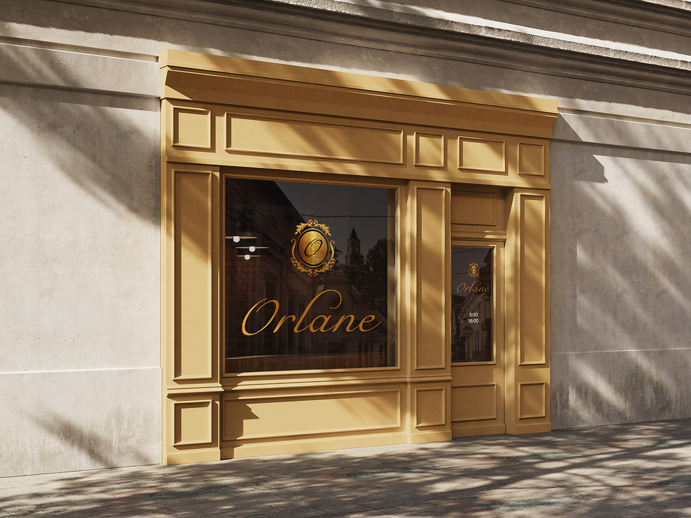
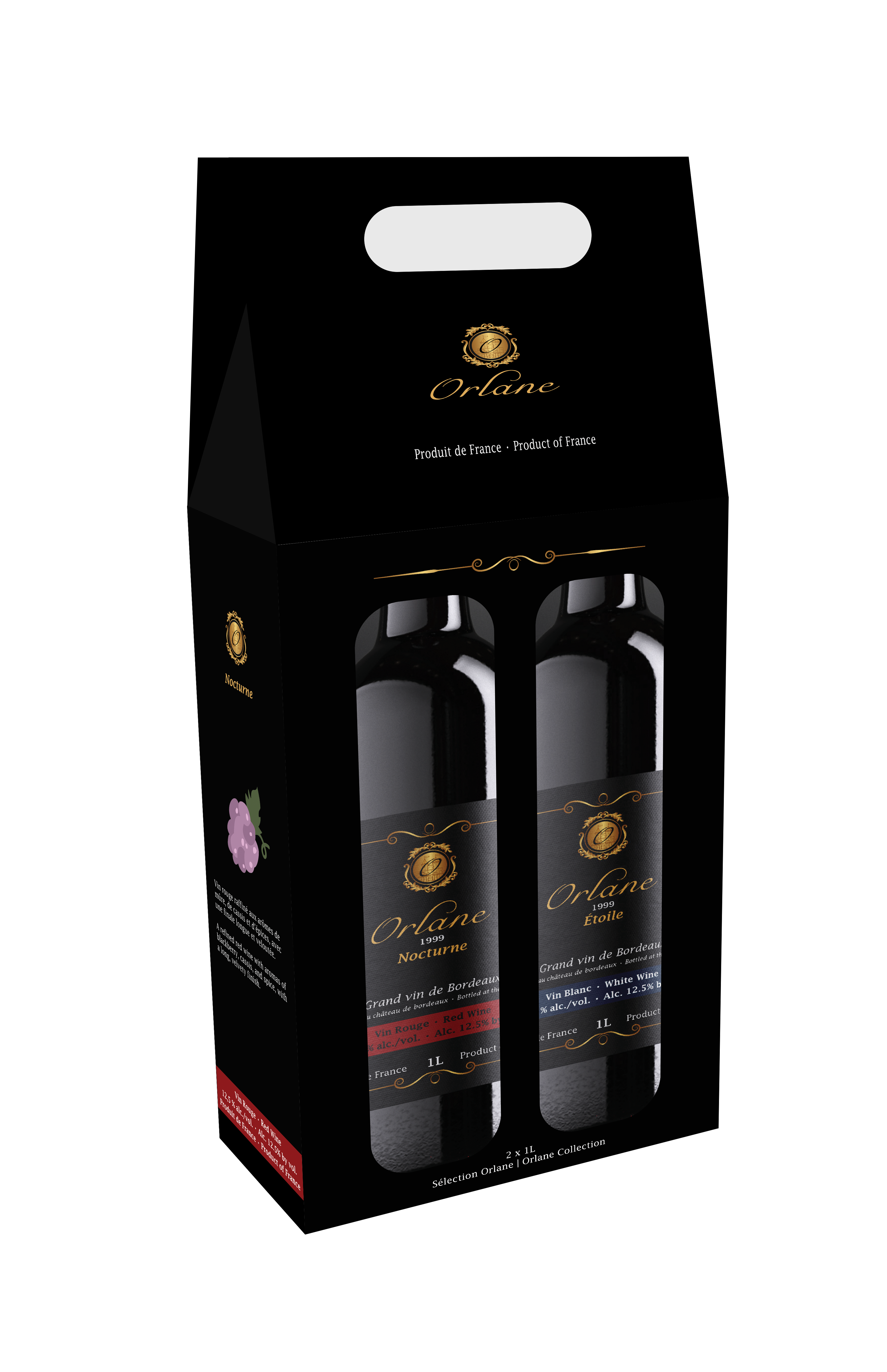
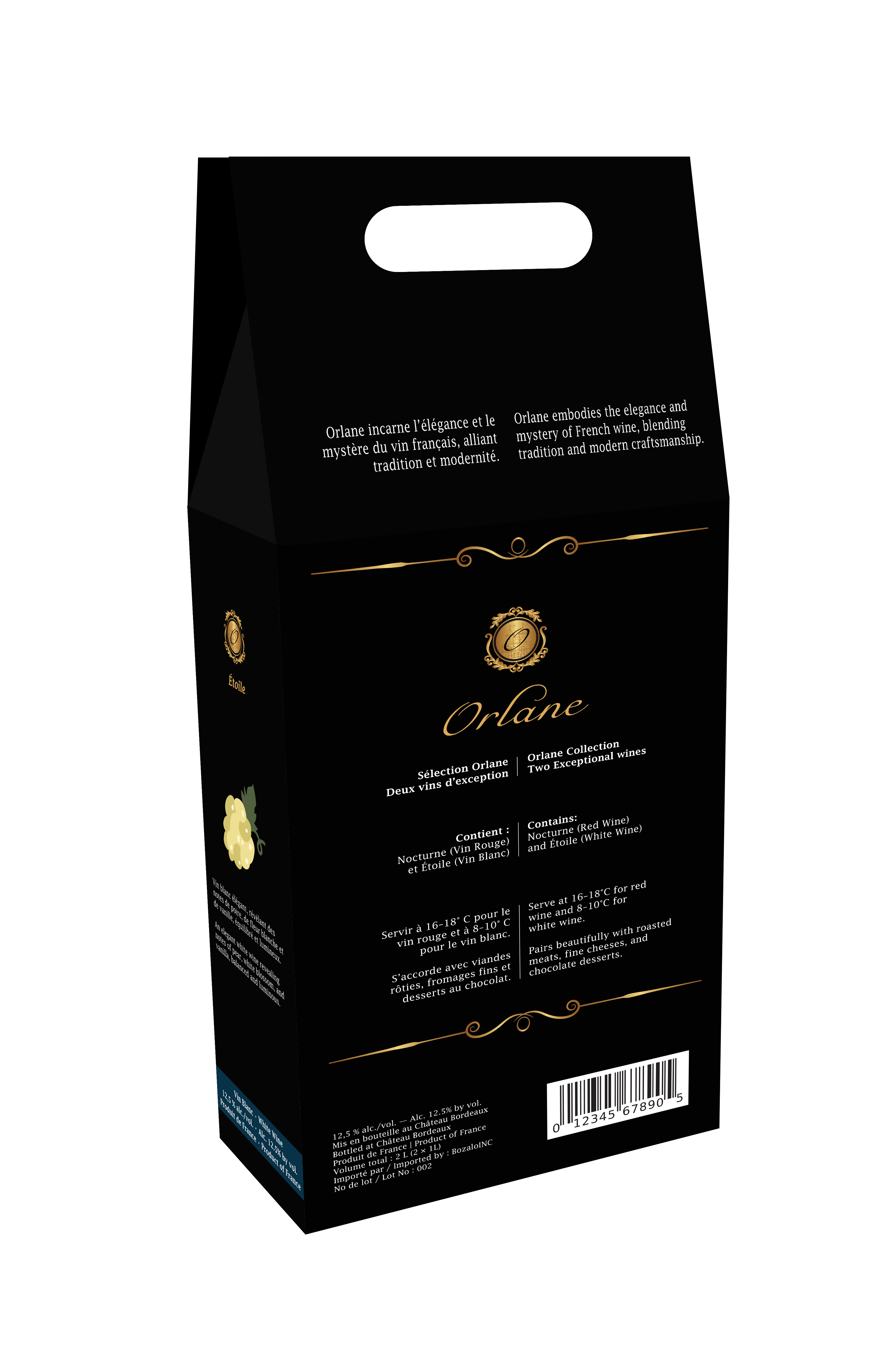
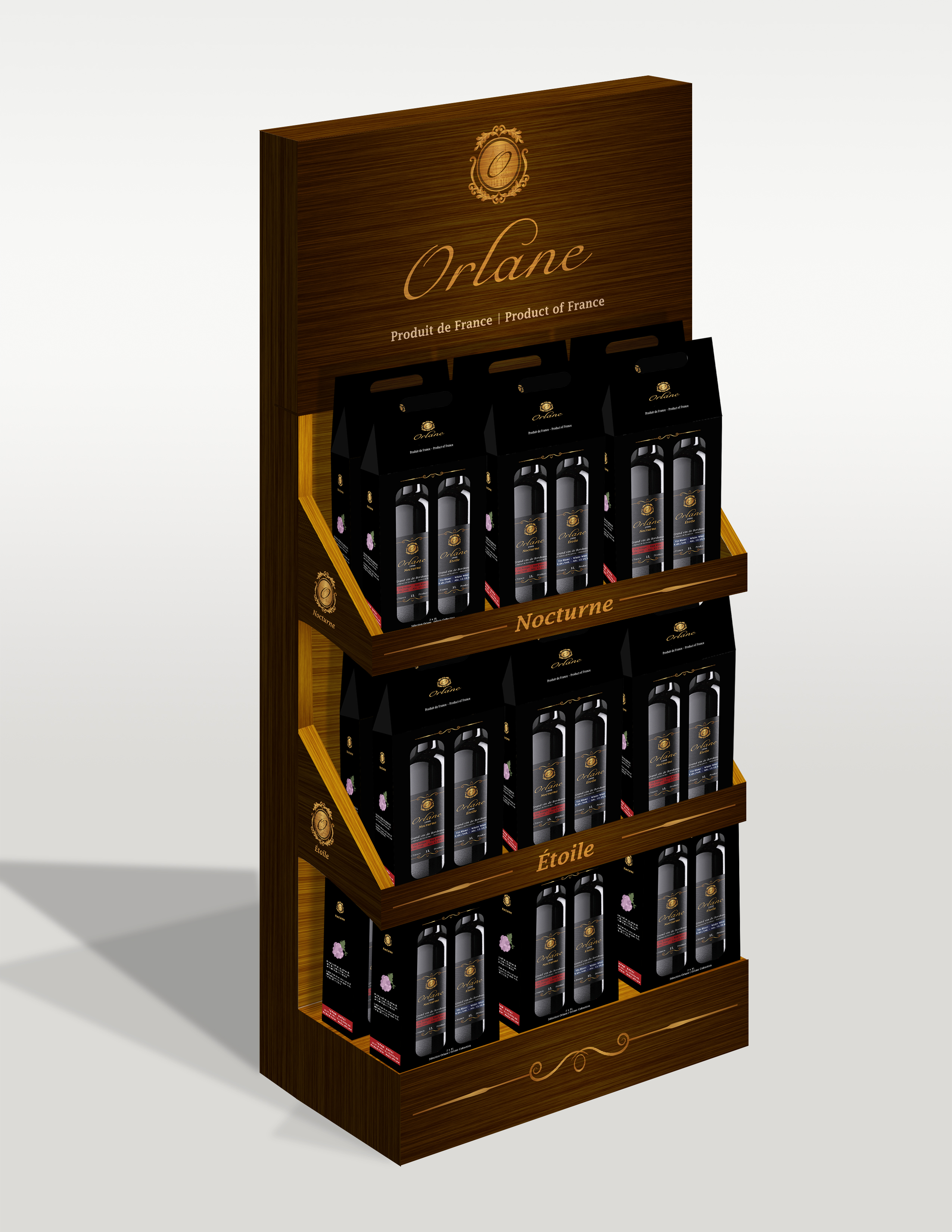
Beyond the bottle itself, the identity was extended into packaging and a merchandising display to create a cohesive in-store experience. The result is a polished branding system that feels elegant, structured, and ready for shelf presentation.
Process
Research, hierarchy, and interaction design.
A major part of the process involved balancing visual elegance with practical packaging needs. The packaging was developed as a bilingual solution for the Canadian market, which meant the layout had to support mandatory legal information without weakening the premium look of the brand.
The final system distinguishes product variations through controlled accent colors while keeping the overall identity unified. From front and back labels to the carrier box and retail display, each piece was designed to reinforce the same upscale brand language.
Selected Mockups
Labels, packaging, bottle variations, and the final merchandising display.